Keith Haring person

Keith Haring artwork Radiant Baby
"Radiant Baby" is one of Keith Haring's most recognizable and iconic artworks. The piece typically features a simple yet powerful image of a baby with a radiant aura or energy emanating from it.

The "Radiant Baby" became synonymous with Haring's style, which was characterized by bold lines, bright colors, and a pop art sensibility. It represents innocence, new life, and the potential for positive change.
The baby in the artwork is often depicted with a simple outline, filled with vibrant colors or patterns. The use of radiant lines or beams coming from the baby adds a sense of energy and dynamic movement. Haring intended for his art to have a universal and accessible appeal, and the "Radiant Baby" is a prime example of this.
The "Radiant Baby" has become an emblem of Haring's art and his message of love, unity, and acceptance. It has been reproduced on various mediums, including posters, t-shirts, and other merchandise, making it widely recognizable and beloved.
Do you have a personal connection or interpretation of the "Radiant Baby"? How does this artwork make you feel?

Keith Haring workarts Montreux 1983
Created in 1983, Monteux is hand-signed by Keith Haring (Reading, 1958 – New York, 1990) in pencil in the bottom right margin and numbered from the edition of 80.
Catalogue Raisonné & COA:
Keith Haring Monteux, 1983 is fully documented and referenced in the below catalog raisonnés and texts (copies will be enclosed as added documentation with the invoices accompanying the work's sale).
1. Littmann, Klaus. Keith Haring: Editions on Paper 1982-1990 (The Complete Printed Works). Germany: Hatje Cantz Publishers, 1993. Listed and illustrated on pages. 24 and 25.
2. A Certificate of Authenticity will accompany this artwork.
About the Framing:
Framed to museum-grade, conservation standards, Keith Haring Montreux, 1983 is presented in a complementary molding and finished with silk-wrapped mats and optical-grade Plexiglas.

Keith Haring's artwork Anti-Nuclear Rally
Keith Haring was an artist and social activist who was passionate about a variety of issues, including anti-nuclear activism. Haring believed in using his art as a means of communication and raising awareness about important social and political matters.
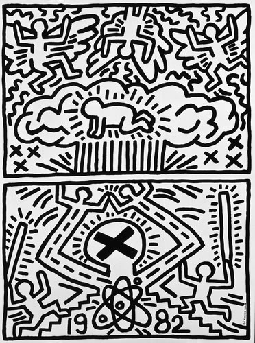
Haring's thoughts on anti-nuclear likely stemmed from his concern for the environment and the potential dangers of nuclear technology. He may have been motivated by a desire to protect the planet and its inhabitants from the negative effects of nuclear weapons, nuclear power plants, or other nuclear-related activities.
Through his artwork, Haring potentially sought to convey messages about the risks of nuclear proliferation, the need for alternative sources of energy, and the importance of peace and disarmament. His art could have served as a visual commentary on the nuclear issue, using his characteristic bold and graphic style to draw attention to the subject.
It's important to note that while we can make assumptions about Haring's thoughts based on his art and known activism, we can't know his exact views and motivations with certainty. Art is subjective, and artists often express complex ideas and emotions through their work.
If you're interested in learning more about Haring's thoughts on anti-nuclear or other topics, I recommend exploring his art, reading interviews or articles about him, or researching his broader body of work and the social and political context in which he operated. This can provide a deeper understanding of his perspective and the messages he aimed to convey through his art.

Keith Haring artwork Keith Haring Growing (Plate 1)
Keith Haring Growing (Plate 1), 1988 is the first installment of the artist’s Growing portfolio of 1988. In this work, Haring illustrates a flat yellow background and a blue ground embellished with short black lines. Atop the center of this backdrop, the artist renders a large red figure outlined in black. This figure appears to be comprised of three individuals disassembled and rearranged to create one towering form with six arms, six legs, and one head. This figure stretches nearly the entire length of the composition and mimics the visual language of hieroglyphics. This language is similar to the language of advertising, and in making this work Haring uses his screenprinted figures to communicate his ideals in a manner that appeals to mass media.
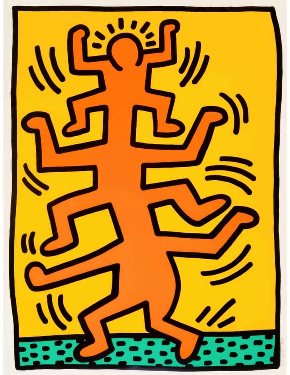
Keith Haring’s Growing (Plate 1), 1988 is part of a portfolio of five screenprints in the artist’s Lucky Strike portfolio of 1987. This body of work depicts fragments of figures rendered in the artist’s signature style dismantled and reconstructed to create enormous singular forms that dominate their compositions. Also featured in this portfolio are Growing (Plate 2), Growing (Plate 3), Growing (Plate 4), and Growing (Plate 5).
Created in 1987, this silkscreen is hand-signed by Keith Haring (Reading, 1958 – New York, 1990) in pencil in the center right image and numbered from the edition of 80 in pencil in the center right image.

Keith Haring artwoke Pop Shop 1
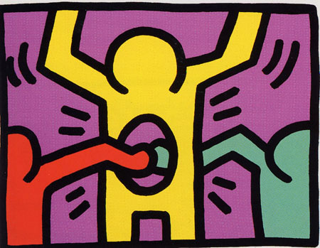
Keith Haring Pop Shop I, 1987 is a suite of four silkscreen prints, each of which comes from an edition of 200. This suite is the first of six Pop Shop suites that Haring created in his lifetime. This one features images using the same five colors: turquoise, red, yellow, purple, and black.

Keith Haring artwork safe sex 1988
Keith Haring's artwork related to safe sex often incorporated his signature style of bold lines, simple shapes, and vibrant colors. He used these visual elements to convey messages about sexuality, AIDS prevention, and the importance of safe sexual practices.
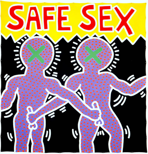
Haring's safe sex artwork aimed to raise awareness and challenge societal taboos surrounding sexuality. He believed in using art as a tool for education and empowerment, particularly in the context of the AIDS epidemic during his time.
His artworks might feature symbols such as condoms, hearts, or other graphic representations to visually communicate the message of safe sex. He might have also incorporated text or slogans to reinforce the importance of protecting oneself and others. By using a visual language that was accessible and easily recognizable, Haring hoped to reach a wide audience and start conversations about sexuality and sexual health.
His artwork could serve as a reminder to take responsibility for one's actions and to prioritize the well-being of both individuals and the community.
Haring's safe sex artwork was part of his broader social and political commentary, as he was passionate about using his art to address important issues and effect positive change. His art continues to be relevant today, as it prompts reflection on sexuality, health, and the power of visual communication.

Keith Haring artwork Best Buddies 1990
Keith Haring's artwork related to Best Buddies often featured his distinct style of bold lines, vivid colors, and simple yet powerful imagery. Best Buddies is an organization that focuses on creating friendships and inclusion for individuals with intellectual and developmental disabilities.

Haring was closely associated with Best Buddies and believed in using his art to raise awareness and promote acceptance and inclusion. His artwork for Best Buddies might have included depictions of people holding hands, hugging, or engaging in activities together, emphasizing the importance of friendship and camaraderie.
These artworks likely aimed to convey the message that everyone deserves to be included and valued, regardless of their differences. Haring's visual language could have been used to inspire kindness, empathy, and a sense of unity among people.
Best Buddies artwork by Keith Haring might have been displayed in various forms, such as murals, posters, or limited-edition prints. It could have been used to support fundraising efforts, raise public consciousness, or decorate Best Buddies events and programs.
Haring's association with Best Buddies exemplified his commitment to using art as a means of making a positive impact on society and empowering those who are often marginalized. His artworks continue to inspire and encourage kindness, acceptance, and the celebration of diversity.

Barking Dog Lithograph 1982
What does the barking dog mean in Haring's Barking Dog Lithograph 1982?

The Barking Dog has become one of Haring's most iconic symbols, first appearing in his New York subway drawing series from 1980–85. It emerged as a symbol of oppression and aggression, acting as a warning to the viewer of the abuses of power that pervade everyday life in America and beyond.
